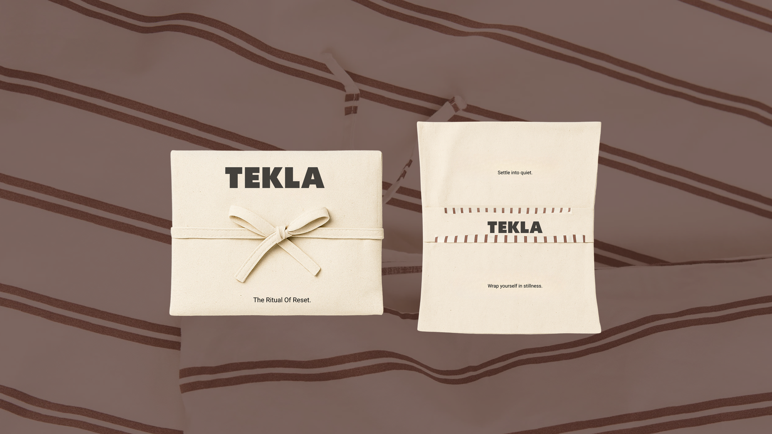
A conceptual packaging project for TEKLA - The Ritual of Reset
Disclaimer: This project was created independently out of admiration for TEKLA’s design philosophy and aesthetic. It is a personal exploration and is not affiliated with or endorsed by the brand.
This project explores how packaging can do more than protect a product - it can enhance the entire experience. Inspired by TEKLA’s calm color palette, honest materials, and quiet luxury, I saw an opportunity to extend their values of mindfulness, sustainability, and simplicity into the unboxing moment.
In a world where packaging is often the first physical touchpoint with a brand, thoughtful design can create a lasting impression, turning the unboxing into a tactile story that reflects brand identity and emotion.
To explore this, I developed a hypothetical collection, The Ritual of Rest, reimagining TEKLA’s bedding packaging through a sensory, mindful lens. While the collection illustrates storytelling through packaging, the pouch design itself is adaptable across all TEKLA products, ensuring a versatile, timeless system that communicates calm, sustainable luxury.
Each product unfolds like a deliberate ritual, inviting users to slow down, breathe, and rediscover the quiet pleasure of rest.

What I Did.
The Initiative
The project began with a question: What if the TEKLA experience started before the first touch of the product?
I wanted to explore how the unboxing moment could become part of the brand’s emotional language - how opening a product could express the same sense of calm, care, and exclusivity that defines TEKLA.
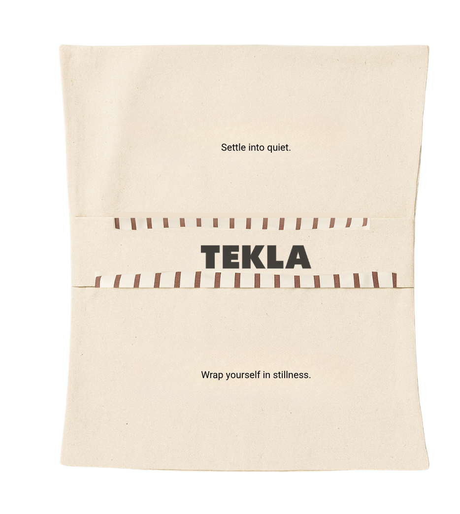
The result is a folded cotton pouch that opens to reveal two inner pockets - one for the duvet cover and one for the pillowcase. Each pocket carries a short line of text, turning the act of unpacking into a quiet ritual.
Soft, minimal, and reusable, the pouch becomes a natural extension of TEKLA’s world - where design and feeling meet.
The Development Process
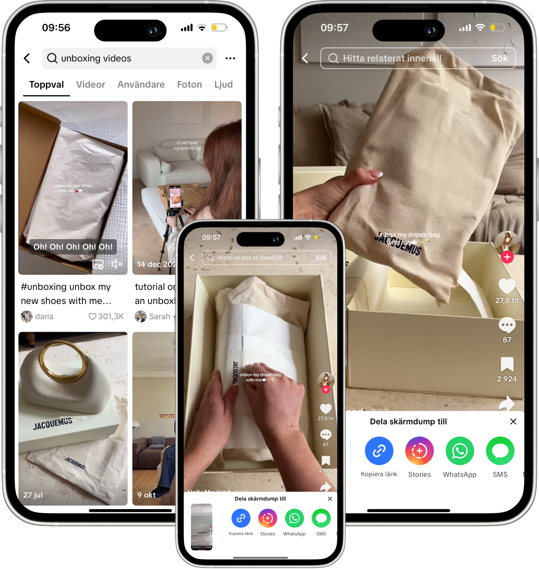
To understand how packaging shapes experience, I researched examples of elevated unboxing moments across different industries. I also analyzed social media unboxing videos, noting how anticipation, tactility, and presentation create emotional connection. What they all had in common was this: the unboxing experience could transform a product into a moment.
The evolution of platforms like TikTok and Instagram has transformed how brands interact with their audiences. Through visual storytelling and shared moments, packaging now plays a central role in shaping perception - extending the brand beyond the product and into culture. For TEKLA, this offers an opportunity to build a fuller universe of calm and quiet luxury through the eyes of its community.

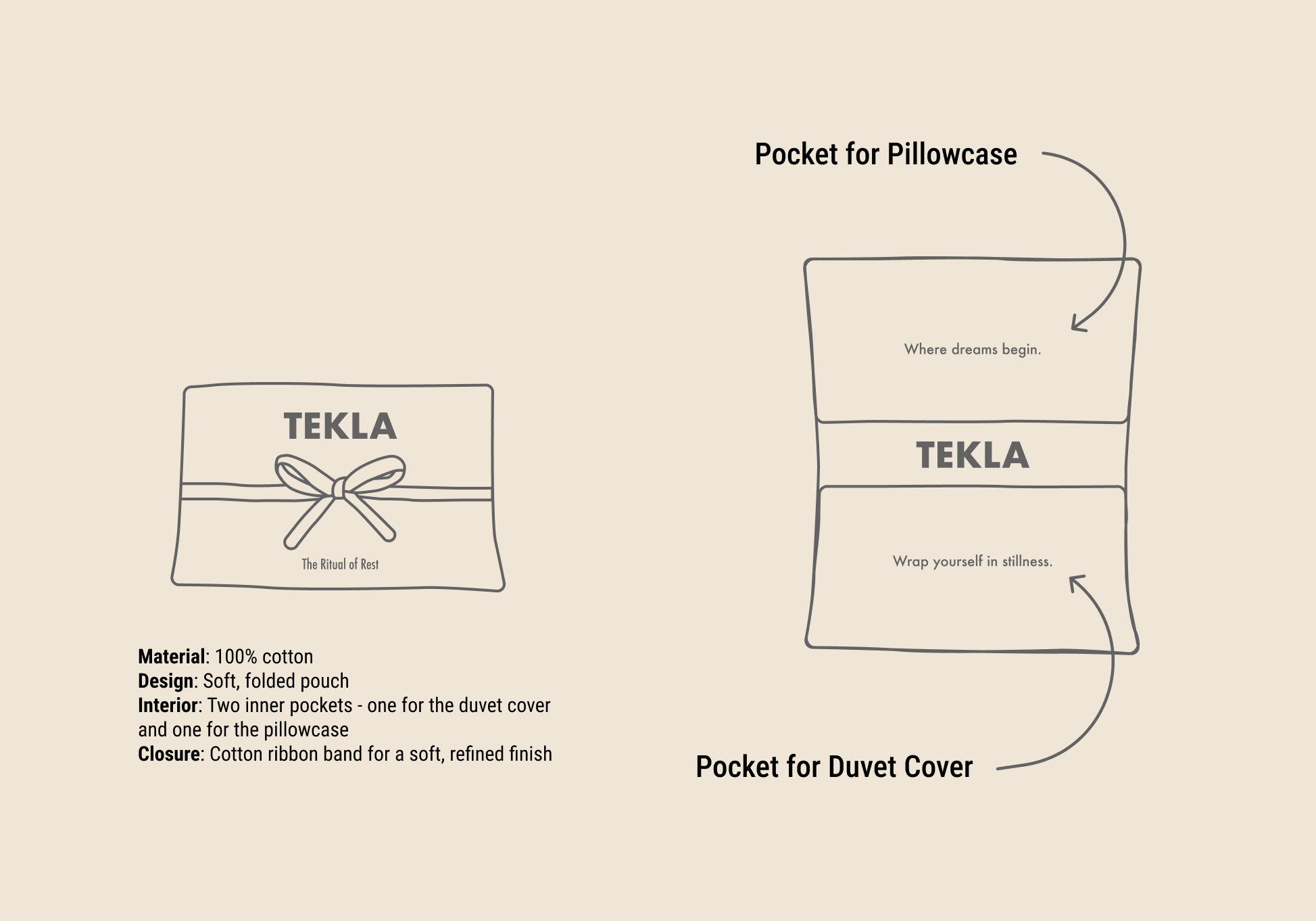
From these insights, I sketched and developed the prototype of the pouch - exploring how it could fold, open, and hold the bed linens with a sense of quiet order. I then turned these sketches into mock-ups and visualizations that showed the concept in a real-world context.
Final Concept
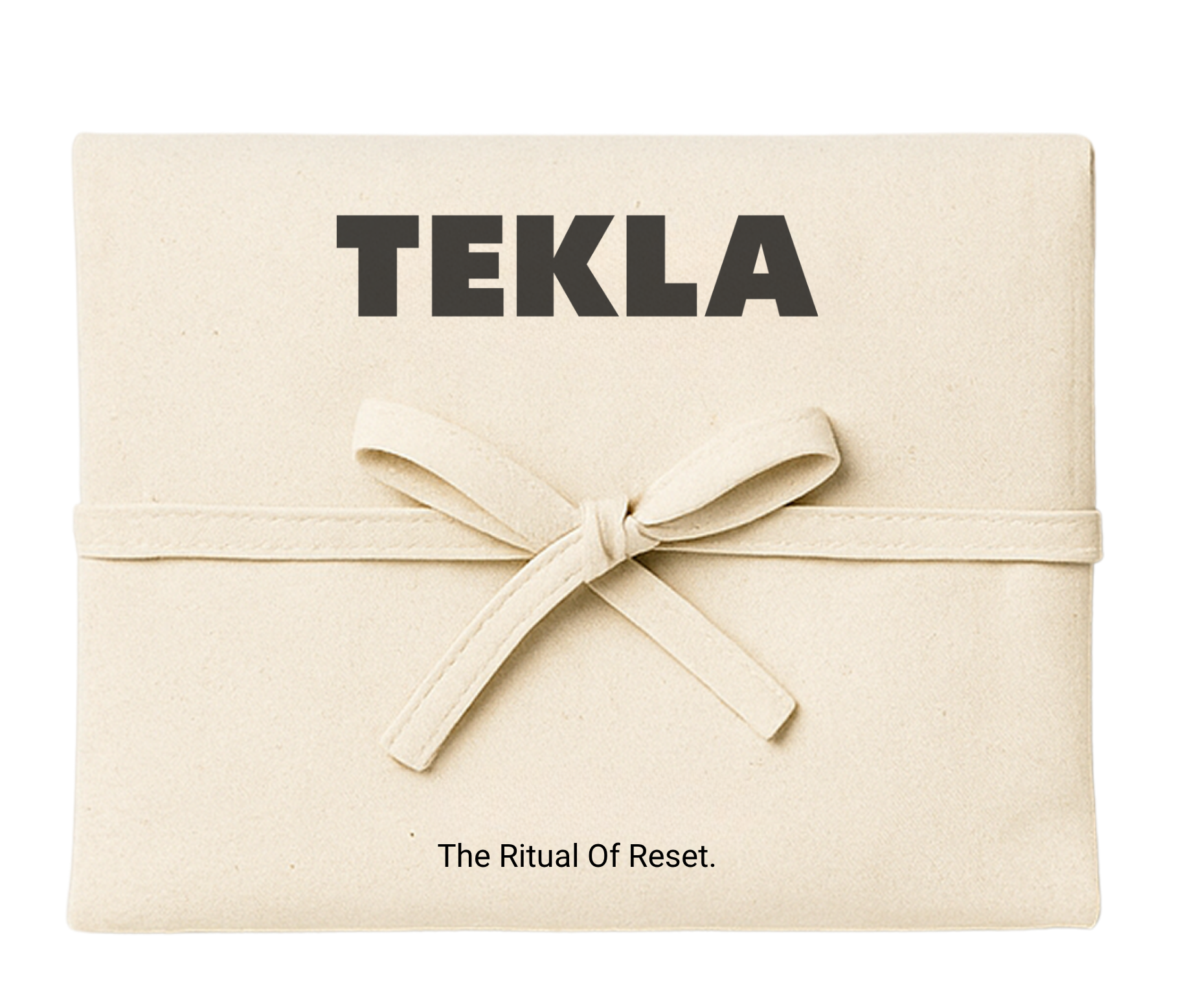
The final design presents a calm and tactile packaging experience that reflects TEKLA’s values of stillness, simplicity, and care.
Crafted from 100% organic cotton, the pouch features soft edges, a ribbon closure, and a naturally minimal form.
When opened, it reveals two interior pockets, each printed with a poetic line to guide the user into rest:
Pillowcase pocket: “Settle into quiet.”
Duvet cover pocket: “Wrap yourself in stillness.”
Together, they form a subtle narrative - from settling into calm to being enveloped by stillness - turning unboxing into a mindful ritual.
Although TEKLA currently sells pillowcases and duvet covers separately, this concept shows how the pouch could be adapted for future collections or in-store use. Without text, it could serve as a versatile, reusable packaging solution, wrapping the customer’s chosen items in the same sense of quiet care.

Promotion Strategy
To visualize how this concept could live within TEKLA’s visual universe, I created a series of promotional materials that extend the calm, tactile feeling of the pouch into the brand’s communication.
The campaign centers on a poster that subtly features the new packaging - keeping TEKLA’s products at the heart of the composition while hinting at the quiet ritual behind The Ritual of Reset collection. To complement it, I developed a set of point-of-sale materials, including three in-store posters that communicate the collection’s themes of calm and renewal through soft imagery and minimal typography.
As a focal point, a large-scale version of the pouch was designed for the store window - a sculptural expression of the concept that invites curiosity and serenity, turning the idea of rest into something tangible and visible.
To launch the collection, TEKLA could host a yoga event under the theme The Ritual of Reset - an immersive experience where guests are invited to slow down, reconnect, and explore the collection in an environment that mirrors the brand’s calm aesthetic. Surrounded by the campaign visuals, the event becomes both a celebration of stillness and an extension of TEKLA’s world - where product, space, and emotion meet in one sensory narrative.


Understanding TEKLA & Translating My Designs
Before creating the packaging, I immersed myself in TEKLA’s visual and brand language - defined by quiet confidence, timeless simplicity, and material honesty.
Rejecting trends, TEKLA designs for longevity and craft. Its muted palette, clean typography, and generous white space create calm precision, while photography captures softness, tactility, and atmosphere.
The pouch extends this world: 100% cotton, neutral tones, minimal typography. The lines “Settle into quiet.” and “Wrap yourself in stillness.” echo TEKLA’s gentle voice. Every detail was crafted to feel calm, tactile, and timeless.
Explore my latest work.
-

Packaging & Concept Development - Coca Cola X MoMa
I designed a collaboration between Coca-Cola and MoMA to reimagine packaging and exhibition materials that blend commercial branding with high art.
-

Brand Book - Emendo Consulting Group
I led a full brand refresh for Emendo Consulting Group, creating a cohesive and scalable visual identity that unified the brand across all channels and empowered teams to design with consistency.
-
Content Creation - Malin Ljung Jewellery
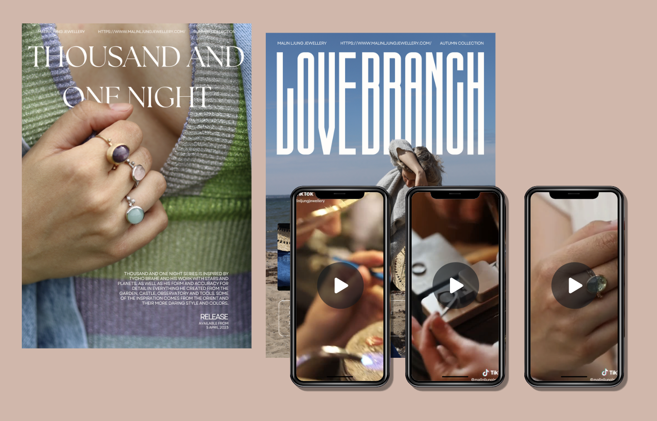
Working with Malin Ljung Jewellery, I translated handcrafted design into visual stories. Through photography, video, and campaign content, I captured the brand’s essence — highlighting its artistry, detail, and sustainable spirit.
-

Concept Development - Djerf Avenue X Modibodi
This project reimagines period care as empowering, stylish, and sustainable. Through a collaboration between Djerf Avenue and Modibodi, I explored human-centered design to challenge stigma, reduce waste, and create visuals, and a campaign that celebrate the female body while promoting eco-conscious choices.
-

Content Creation - Emendo Consulting Group
I craft visuals that balance creativity with strategy. From brand identities to full campaign systems, my designs are consistent, scalable, and built to make an impact. At Emendo Consulting Group, my brand refresh led to a 132% growth in LinkedIn followers and a 20.5% engagement rate — proof that design can drive business growth.
-

New Website - Emendo Consulting Group
Emendo’s previous website struggled to reflect the company’s expertise and structure, with eight business areas and no unified identity. After establishing a solid brand foundation, I led a complete redesign using the Design Thinking process. The result was a streamlined, intuitive, and trustworthy digital experience that aligned stakeholder needs and clearly represented Emendo’s capabilities.